TGunitedcardists,
Cheers for the feedback! Its amazed me how much great stuff, good and bad I have had back from people who the deck was just "not their style". Love to touch on your points here for my design ideas and why it is the way it is.
Just pasted your points here to make it easy to understand.
Pros:
Looks like a lot of effort went into this deck.
You have no idea! Its been a real passion!
The colors are quite nice.
Thanks, something I changed 1000 times before I found the right one
The back design is different...but...
Legends produce excellent cards. (the Serpentine decks have an excellent finish)
Legends Diamond Finish all the way. I originally was printing with another company but I myself have a pretty large collection and was using legends cards at the time and wanted mine to be the same. Also was taking a bit to long to sort out the quotes for pricing (not their fault, busy time of year for all) and Lawrence Sullivan was overly friendly and helpful. Both in quoting and design advice.
Free world wide shipping.
This for sure. Half the backers already are from all corners. Being from Aus myself I almost always have to pledge high usually for 6-12 decks to make it worth while. This was something I really wanted to do so that everyone had the same chance.
Tuck boxes look interesting.
Cheers. Its something I spent as much time on as the rest of the deck.
You seem upbeat and have taken other forum members' criticism in stride.

Ive been not only an artist and musician but also have been coordinating weddings and various retreats for a very long time. Aside from the obvious "beauty is in the eye of the beholder" argument that is usually thrown around as a defensive thing (its true though so that's OK). Some people just can't be pleased, and who cares if someone doesn't like something. I'm from the country that eats Vegemite for breakfast and smiles! That was the advertising campaign in the 50s and everything! There is no accounting for taste. I didn't design this on someone elses specs, I made it for me. In the hope others like it.
Other side to that is, its not printed yet. I'm open to ideas always. And they only come from criticism sometimes.
Cons:
The Kick starter video didn't do much to sell the cards.
This was a sticking point for me at one point. I had two issues. My research showed me that many PC kick starters had a video that "sort of" showed the cards, or didn't have a video at all. I had the added bonus of not having a previous deck to spruik from or about. But what I do have is my previous strength and track record as a devoted artist. Also the deck was specifically designed around the same principals as a concept idea. Last but not least, no actual cards to have in video and only able to show renders like everyone else. I decided to let the images and KS page speak for the deck as many others do and let the video show my other work to let people know where I come from and who I am.
Unusable for games. (completely unusable)
This is an interesting one. Would really love some extra feedback on this one for sure. I have over 300 board and card games in our collection and run a local regional gaming group. Along with a reasonable collection of cards. Some of the design stuff I used specifically for some games so I would love to know specific shortfalls in case there is something I really should address for gaming use.
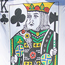
The court cards aren't really court cards.
I guess this is the design thing here. The courts are exactly that. Each a "interpenetration" of their standard deck counterparts. Including the Suicide king. I just did it ... differently. There are other things about them that are throwbacks to the same but I don't want to point them out as part of the concept of "Perspective" was "hidden in plain site". In saying that I have another deck I have been hand drawing as well for some time. Still very different but much closer to what you would call traditional. Just saying that point to I guess get across that I'm not against standard courts, I love them, but they were not what I wanted to do here.
They don't have a big pip to make them easily recognizable.
This is interesting again on my fascination on perspective and how people see things. The pips are all the same size or larger than a standard Bike deck. I measured Bikes, Monarchs, EgyLegends, Owl eyes and used these measurements to decide on what I wanted. The spades are actually a little larger than normal as are the diamonds. The indices are the same too. Interesting they seem small to you.
The jokers have way too much text.
Can't remember which joker it was but another deck recently had a small amount of text at the bottom similar and I really liked it. So just personal choice really. Also the Jokers from Race and Red decks will be identical except for colour change same with the "black" cards. I did this on purpose, text and all to allow interchangeable decks and or cards for magic effects. Colour changes, for fronts and backs. The text also is there specifically to allow me to have a reveal on the second Joker. (not to spoil that for others).
The text on the back design isn't need IMHO. Would look better without it.
To a certain extent I can see this point and even agree. My profile decision on this was due to my upcycling fascination. You see I go through decks pretty regularly (another reason to buy bricks at a time) and I have all these worn out cards lying around. I never throw away anything so I use these for various projects. One was to number the tables in our dining room at home so the waitresses can know which table is which. Its cool, pretty and gets people talking. I also really love the Monarch and other T11 tucks, including the text, but if I use the cards from something like this the text is gone. I guess there is always the argument for no text on a card back, especially with a current trend popping up to see very minimalistic card design with plain backs, NOC etc. (fine for those who like them). But I wanted to keep it there to be part of the design and also identify the deck when the tuck is no longer around. My offset to this was to make the back symmetrical 100% which just meant more text. Also the mirrored text effect was a design element I wanted from the start.
The custom pip layout is too crazy IMHO.
This also specifically what I wanted to have as much empty space on the non indices corners. I know its very different to what people are used to but with the pips not being standard as many others are I felt I had the freedom to be a little more unique. The blank sections left on the cards I hope are used by cardistry and magic fans alike for various effects. Only time will tell I guess.
High price.
I know its a bit more expensive for the lower levels than USA backers are used to but at 6 or more its more than affordable. Also with our $ being so low to the greenback its more affordable again there. Remember it looks more expensive than it is until you do the conversion.. The idea too was to be able to fund the whole project and if we get far enough to get the Limited Shell decks as well to just give them away free to certain levels. The Higher price allowed me to do so sooner. I thoroughly checked other projects being fulfilled in a similar manner, and used these as a baseline. When you take into account he various levels, the free shipping and the AUD$ conversion its all pretty good IMHO. The one question I had about price I explained the same and then the person backed the deck. So it must be reasonable to most.
High pledge goal for your first project.
This I know. I agonized over it. Sure I should play it safe and just make one deck. Just make it simple. Just make it small. Slink in an out. But its not really my style. I made a secret door out of garbage and hid a message in plain site with 2500 pieces of broken junk tile. I struggle greatly doing things by halves. So I took the risk and went with the full plan.
Misc. Notes:
Yes, boobs and balls. Everyone adult sees it.
Lol only here on UC so far. But I don't mind. It was meant to be different to everyone different view and as I said, Whatever floats someones boat and get them to pledge is alright with me.
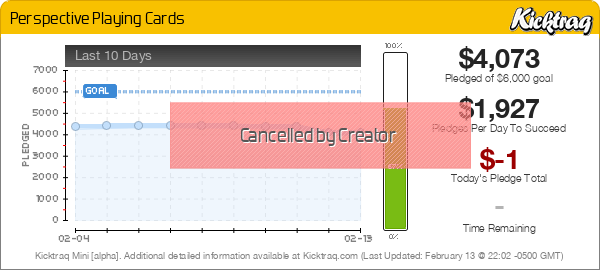
I wish you luck, but realistically I think you have a huge uphill battle to get this deck funded.
Maybe right. But not afraid of a little work. And the first 24 hours is not up and nearly to 10% so here's hoping !
Constructive ideas if you don't fund and want to continue version 2.0.
I would go with a regular style pip for the indices, and then you stylish revamped pips in a regular layout/orientation.
Real court cards with a big pip to the left of the head.
Remove the text from the back design.
Remove a lot of the text on the jokers.
I think I could fund one deck in a heartbeat. And I have addressed some of my ideas on these points. I can see that it might make it more appealing to a larger group but that's what bikes are for right? The Jokers Idea is sound and the text on the back. I already have an idea for a second "Perspective" project deck (to ambitious?) and these are ideas I would definitely take to this one. But here I really think some of the design points are important to what I wanted personally.
Thanks so much for your comments though. I'm really enjoying all this. Everyone mentioned it could be dreadful amount of hard work and negativity but this is fantastic IMO. Friendly, constructive and involved. I have designed our home around community living so this just feels like a natural extension of that.
Thanks again.
De.