rousselle wrote:Which other decks of theirs have the "Master Finish" (that this new "Classic" is being compared against)?
I'm not particularly impressed with the "Emerald Finish" of the Serpentine decks. Diamond finish, on the other hand, I rather like.
Those of you who have played with these... are they more like Gnostics/Luxx/Legends V2, or more like Serpentine? (Or, for that matter, more like Global Titans/Nauticals?) Or... none of these?
I can shed some light on this and address some of the other comments as well.
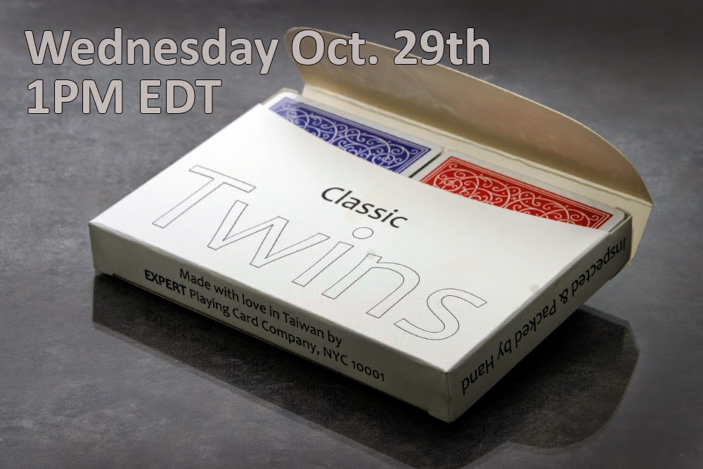
On the finish. As you all know the finish (sometimes confused with coating) refers to the embossing (or lack of it) on the stock. Unlike USPCC we do not start with smooth paper and emboss it, we use pre-embossed stock. This new Classic Finish is actually new stock that has a somewhat less smooth (than Master) finish. It's a little thicker (tiny bit) and a little softer. They wear more like the American made decks many of us are used to now. This stock was discovered by Lawrence Sullivan of Legends Playing Card Co and he tested it on the very limited Sharps decks. It printed very well, handled well and didn't wear out quickly so we named this stock/finish "Classic Finish" and are now testing it phase two, Classic Twins and Classic Black from EPCC.
I totally understand some of the comments about the deck design not being really exciting and those about the trend that Conjuring Arts is not making the decks we market more custom and with edgier artwork. We do this very purposefully. Our mission at Conjuring Arts is and always has been to create decks that are usable by magicians. Although, like many of you, I love custom faces, if they are too far off standard it makes the deck appear trick to the audience and that isn't what magicians want!
This kind of product serves several purposes. It helps Conjuring Arts raise funds to pay staff (we are a nonprofit as most probably know). It also is a way for Expert PCC to show off new techniques, stock ideas, boxes, materials etc. We do that in a sort of simple way so that the creative deck designers can take our new ideas and really show them off. It's kind of a way to showcase new things without competing directly with the designers EPCC prints for. For example the Exquisite Bold was a great old back design and our sparing use of gold foil on the back was more proof of concept than a design breakthrough. We leave it others to use foil in stunning ways (like Jackson Robinson has with his new decks for the 52 Plus Joker club).
I hope this explains things a bit and we very much appreciate everyone's support and comments.
Thanks everybody.