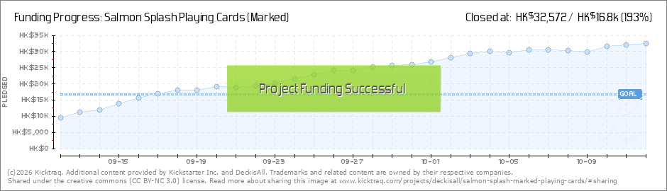
Hi everyone, we are excited to share that our campaign, The Salmon Splash Playing Cards, is now live on Kickstarter!
Inspired by one of the most acclaimed Japanese sushi flavours and fully marked with an original marking system,
this is a truly unique deck you won’t want to miss. Most importantly, we will not send the decks to wholesale - which means the decks won’t be widely available for retail after the campaign ends!
Aiaiai... I sure believe that the marking system is clever and fun but when that's the only selling point then you're on to a very niche clientel. The tuck and the back design do disencourage me to check out the rest of the design/campaign to be honest.
Harvonsgard wrote: ↑Tue Sep 12, 2023 10:27 am
Aiaiai... I sure believe that the marking system is clever and fun but when that's the only selling point then you're on to a very niche clientel. The tuck and the back design do disencourage me to check out the rest of the design/campaign to be honest.
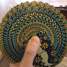
Thanks for your feedback! Just added a pic showing the custom faces.
Give me a moment to put on my seatbelt before harvonsgard replies - I know how he feels about dividing lines and light customization on the faces may not be enough to distract him…
Harvonsgard wrote: ↑Tue Sep 12, 2023 4:18 pm
Hehehe, I'm an open book for Gandalf. Let's see what STL thinks; it's orange afterall.
lol, well, you know this deck is not for me. in any way really. standard courts and a banner in the middle, oy. what hit me most was the very odd placement for the marked portion of the deck. if these cards are being held in a fan, can you even really see the marked part at the top and bottom edge of the card?
youre right, i do love orange though.
Looks like we have some misunderstanding about the marked part here.
davegk wrote: ↑Wed Sep 13, 2023 6:32 pm
The back design looks remarkably similar in concept to my Cambio deck design from years back—even uses a similar circular rendering of a fan...
cc9.jpg
salmon.png
We are sorry that we did not come across your deck earlier. Nevertheless, we believe that the most important part of our design is the original marking system on the back rather than just the pattern.
I wouldn’t be too sorry - they are only coincidentally similar due to the geometry of 7 stripes, with 7 being pretty much the only choice of stripes for the fish.
Other than the fate of geometry and scale - I think they look about as similar as the moon and the sun.
1. I'm pretty sure that I'm not *literally* a pot...last I checked I was still in human form.
2. Who said anything about theft? I just thought the similarities were fascinating. It's entirely common for multiple people to come up with a similar visual concept when working in isolation from each other. Borrowing design concepts from other sources is also very common (we call it "inspiration"). You guys are clearly trying too hard to read between the lines or derive intention where there is none (projection, perhaps?)
3. I'm not a huge fan of the level of negativity generally surfacing around these forums and would highly encourage a more optimistic and positive mindset.
Some people may be a bit hot under the collar - and you may not be a pot, but you did actively generate some of that steam so…
There is some history and as much as you move past it, others have a right to remember and be upset - that was earned. Taking the occasional pot shot for it is just par for the course.
I would add that the optimism and positivity here is pretty high overall - and I think the Alice thread proves that.
The back design looks remarkably similar in concept to my Cambio deck design from years back
I think it does too but then I think many things look similar to each other
Here is a 1964 deck from the Hochman Encyclopedia (A34) It is an advertising deck for Reynolds Aluminium Company
Excuse the pic quality as that is how it is in the book/digital edn
Attachments
Reynolds A34 from Hochman.jpg (23.91 KiB) Viewed 8017 times
KoD - my initials, no wonder I grew up a lover of playing cards Avatar - Honeybee (No.15+17) Tuck pic by Randy Butterfield for PM
davegk wrote: ↑Thu Sep 14, 2023 10:28 amI'm not a huge fan of the level of negativity generally surfacing around these forums and would highly encourage a more optimistic and positive mindset.
Didn't you get the memo? Humans are terrible beings! They are always - I repeat - ALWAYS ill-intended, are destroying the planet, always toxic to each other and in general the world would be better without them!
Perhaps we should highlight that our design extends beyond mere stripes. It's about the theme of salmon sushi and an original multidirectional marking system, and we believe these are what set our design apart.