
Los Angeles 10am PST
NY 1pm EDT
London 6pm GMT+1


Adonael wrote:That's a huge goal, and I'll admit the tuck looks fantastic, not at all interested in the cards though. Regardless, I of course could never support this creator. I could put what I think of him into words but it wouldn't pretty (though I think I summed it up nicely in the past 'This guy is basically the Ukranian equivalent of a sociopathic White Nationalist.', or useful, as apparently it's all already been forgotten. And even then he sadly had drooling morons who defended what he said and revealed himself to be. So no thanks and I'll see myself out.


rousselle wrote:You are a fussy, picky guy.
Lotrek wrote:Given the number of morons produced in the world every day, a pessimist is actually a well informed realist.
Räpylätassu wrote:"Tyhmyydestä sakotetaan." You get fined for being stupid.


My thoughts exactly. The back design is often what makes, or in this case breaks, the deck for me.theCapraAegagrus wrote: The mono-color back design is very disappointing, though.

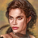
You may have meant that to mirror testicles, but I read it as breast-sicles (like popsicles)!BaconWise wrote: I'm not trying to be a prude here. I don't mind bewbs and beautiful women on playing cards (I am a fan of Gio's, after all). If Sviatoslav wants to portray them in an authentic light, as warriors, why not have them dirty, or covered in blood or war paint? Why not have them displaying some ferocity along with those perfect breasticles?

Exactly what I said above. [emoji4]james001a wrote:That tuck really reminds me of the T11 High Victorians deck. Anyone else see it?


I don't think that adding background colors does this design any justice. I think that all of the white should stay. I just think the other elements could have different colors to enhance the overall appeal.Sviatoslav Pashchuk wrote:-CapraAegagrus - I have several variants of the back, I will try to show. The monochromatic version seems the most classic to me.
rousselle wrote:You are a fussy, picky guy.
Lotrek wrote:Given the number of morons produced in the world every day, a pessimist is actually a well informed realist.
Räpylätassu wrote:"Tyhmyydestä sakotetaan." You get fined for being stupid.

I will most likely back the deck as-is but if we're voting I think the extra color on the 2 right-most renders above are my favorite, especially the last one since it matches the back of tuck. I like when the back of cards and back of tuck match.theCapraAegagrus wrote:I don't think that adding background colors does this design any justice. I think that all of the white should stay. I just think the other elements could have different colors to enhance the overall appeal.Sviatoslav Pashchuk wrote:-CapraAegagrus - I have several variants of the back, I will try to show. The monochromatic version seems the most classic to me.
The blood red color was a good start IMO.
Although that 5th color scheme is attractive, it does have a similar vibe with the Iron Spades deck tuck box from the Iron Clay campaign. The 3rd blue on brown also has a similar color with Midnight's Wild West Black Hills edition. Personally, I feel that the 4th red on yellow has that aggressiveness matching the Amazon/Spartan theme, but the monotone back isn't bad at all.Sviatoslav Pashchuk wrote: I have several variants of the back, I will try to show. The monochromatic version seems the most classic to me.
Users browsing this forum: Disenchanted_11, EndersGame, Eric Lee, Google [Bot] and 44 guests