I've been playing with the idea for a second addition to The Coven deck. BUT the big question that needs to be asked . . . is it worth the time to complete?
Personally, I think I can bring more to the design side this time around, while still maintaining a similar feel. Yet I can't help feeling I'm being lazy trying to find a new theme
Having said that, I think Kickstarter is starting to run dry the themes pool, and finding something truly new is getting tough.
The image below is what I've been playing with over the last couple of nights. So a similar theme as the first but leaning more towards the Sisterhood style for the characters.
Let me know what you think (I know this is the place for honest opinions, so let me have it )
Re: The Coven - Second Edition
Posted: Wed Aug 07, 2019 2:50 pm
by hsbc
Go for it! The whole point of Kickstarter is that you won't waste money making something there's no demand for
Re: The Coven - Second Edition
Posted: Wed Aug 07, 2019 3:09 pm
by Räpylätassu
Go for it!!!
Re: The Coven - Second Edition
Posted: Wed Aug 07, 2019 3:22 pm
by MagikFingerz
hsbc wrote:Go for it! The whole point of Kickstarter is that you won't waste money making something there's no demand for
Not money, but time. I can totally understand coming here and asking/gouging the interest before designing enough for a kickstarter project.
Honestly, I'm not sure I'd be a backer again. As nice as the artwork is, my budget is tight and more of the same might not make the cut
Re: The Coven - Second Edition
Posted: Wed Aug 07, 2019 4:19 pm
by STLBluesNut
My opinion is more cleavage [emoji6]
Sent from my S10+ using Tapatalk
Re: The Coven - Second Edition
Posted: Wed Aug 07, 2019 6:55 pm
by rousselle
Maybe this time you can shoot for the blood-red borders?
Re: The Coven - Second Edition
Posted: Wed Aug 07, 2019 9:29 pm
by Adonael
rousselle wrote:Maybe this time you can shoot for the blood-red borders?
This. I didn't back the Sisterhood of Blood Vol 2 precisely because you chose not to do the red borders. Without them it was just way too similar to V1, lay out some cards from each version next to eachother and at a glance I wouldn't be able to tell the difference. So in my mind, there was no point having both. The same would go for a Coven Vol 2 if there are no significant differences, as I do have the first of that too. I really enjoy both Vol 1's, but I don't like having doubles .
Re: The Coven - Second Edition
Posted: Thu Aug 08, 2019 11:35 am
by 52Ravens
Thanks for the comments, they all really help
hsbc wrote:Go for it! The whole point of Kickstarter is that you won't waste money making something there's no demand for
That's very true, this is the magic of Kickstarter, but if I can see it's going to fail at this stage I could put my time to another project
MagikFingerz wrote:As nice as the artwork is, my budget is tight and more of the same might not make the cut
This is what I'm afraid of. Kickstarter as flood the market so collectors have to be very selective with what to back (Or have massive amounts of money)
STLBluesNut wrote:My opinion is more cleavage
I'm taking this as a general rule for living life
rousselle wrote:Maybe this time you can shoot for the blood-red borders?
Haha will this be the only selling point for you?
Adonael wrote:I don't like having doubles
As a collector, I can see what you mean. But, if this was a witch theme that wasn't connected to the coven you'd consider pledging? Or is it that you don't like decks that look too similar?
I appriciate all the feedback, thank you!
Re: The Coven - Second Edition
Posted: Thu Aug 08, 2019 11:56 pm
by rousselle
Kirk, I've loved your work from the beginning, and I am certain I will be backing this next project of yours, as well. Red borders are not necessary for me. But... they *are* an opportunity that I think would be fun to explore with this particular deck. If you're going to do a v.2, make it different!
But, no, I'm not a one-note guy. If I were, I'd be asking you to do this with cold foil....
Re: The Coven - Second Edition
Posted: Thu Aug 15, 2019 2:57 pm
by 52Ravens
rousselle wrote:If I were, I'd be asking you to do this with cold foil....
The collectors do love some gold foil, perhaps this is where I've been going wrong, I need to bite the bullet and do a gold foil deck
Re: The Coven - Second Edition
Posted: Mon Aug 19, 2019 4:53 pm
by STLBluesNut
52Ravens wrote: I need to bite the bullet and do a gold foil deck [emoji38]
Cold foil doesn't have to be gold foil. Speaking for myself only, gold foil is about 10th on my list for foil colors.
Copper>silver>colors blue, red, etc>gold
Sent from my S10+ using Tapatalk
Re: The Coven - Second Edition
Posted: Wed Aug 21, 2019 2:56 pm
by 52Ravens
Hey!
So here is another little test to see what you guys think. Borderless and a little less "standard deck"-ish... While still hinting at some similar patterns and icons. I guess this could be a full colour design but I kind of like the single colour look.
Any input is gratefully appreciated
Re: The Coven - Second Edition
Posted: Wed Aug 21, 2019 3:27 pm
by BaconWise
This update looks really good. I like the lack of a boundary box and the image looks awesome. I think the faded treatment is a bit heavy on the index itself but it looks great on the rest of the card face. I would just make sure the Jack is super-sharp so it can be easily identified when used for gameplay. Thanks for the update!
EDIT: I'm also digging the sepia tone. Looks bueno
Re: The Coven - Second Edition
Posted: Wed Aug 21, 2019 5:17 pm
by Räpylätassu
Looks awesome!!
Re: The Coven - Second Edition
Posted: Wed Aug 21, 2019 6:27 pm
by montenzi
I like it! Better without borders. And different vs. first editions.
Re: The Coven - Second Edition
Posted: Wed Aug 21, 2019 10:18 pm
by Kage X
BaconWise wrote:This update looks really good. I like the lack of a boundary box and the image looks awesome. I think the faded treatment is a bit heavy on the index itself but it looks great on the rest of the card face. I would just make sure the Jack is super-sharp so it can be easily identified when used for gameplay. Thanks for the update!
EDIT: I'm also digging the sepia tone. Looks bueno
+3000
Re: The Coven - Second Edition
Posted: Thu Aug 29, 2019 2:11 pm
by 52Ravens
Hey!
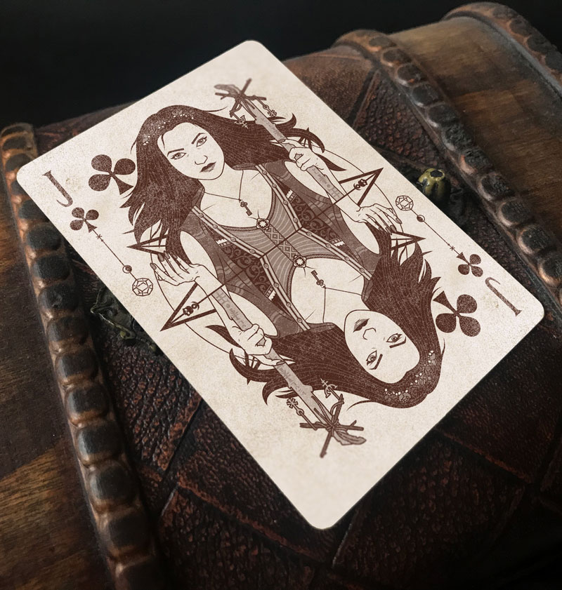
Ok, so I've been playing with the borderless version to see how the next card along feels. What do you guys think?
The star design that will be behind each court character is now complete, hopefully it isn't too busy as this will be the basis of the back design.
The pink colour is a little test too. Red will work but I felt the pink might add more to continue to distiguish it from the original coven deck.
Thinking on that, the new working title will be "The Craft". Again, it's not too far away from the coven deck but close enough to tie them together.
I'd love to know your thoughts
Re: The Coven - Second Edition
Posted: Thu Aug 29, 2019 2:24 pm
by Räpylätassu
I love it!
Give her some cleavege though, she is flat as a board
Re: The Coven - Second Edition
Posted: Thu Aug 29, 2019 11:27 pm
by robcan0630
Looks good. I'm liking the borderless as well.
Re: The Coven - Second Edition
Posted: Fri Aug 30, 2019 1:56 am
by rousselle
Making this borderless gives it a different mood/vibe/feel from its predecessors, and I like that.
Re: The Coven - Second Edition
Posted: Fri Aug 30, 2019 11:14 am
by 52Ravens
Räpylätassu wrote:Give her some cleavege though, she is flat as a board
They can't all be blessed, she has a little
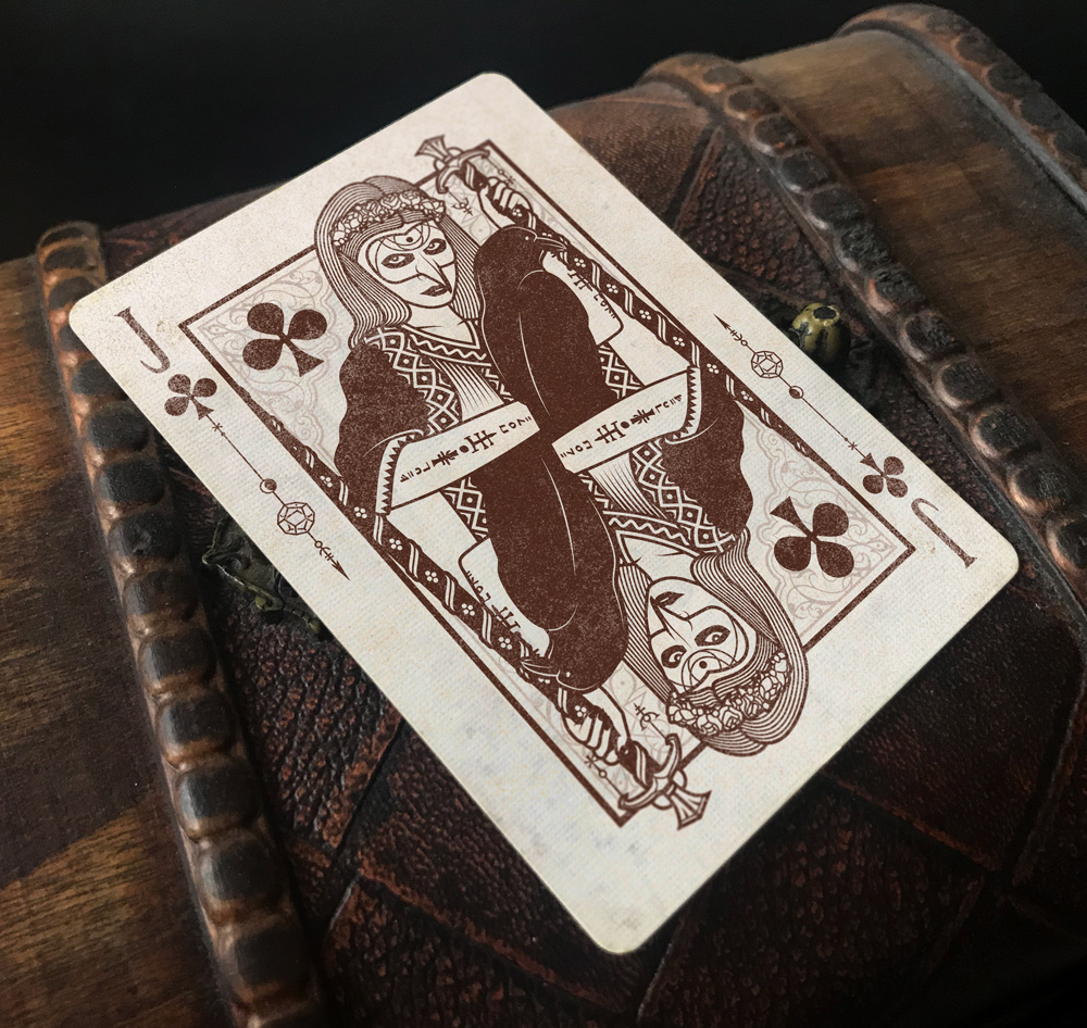
Glad to see that the borderless is working for a few people, on to the Jack of spades (and beyond!)
Re: The Coven - Second Edition
Posted: Fri Aug 30, 2019 3:08 pm
by rousselle
Wouldn't that be... the Jill of Spades?
Re: The Coven - Second Edition
Posted: Sun Sep 01, 2019 1:39 pm
by 52Ravens
Hey!
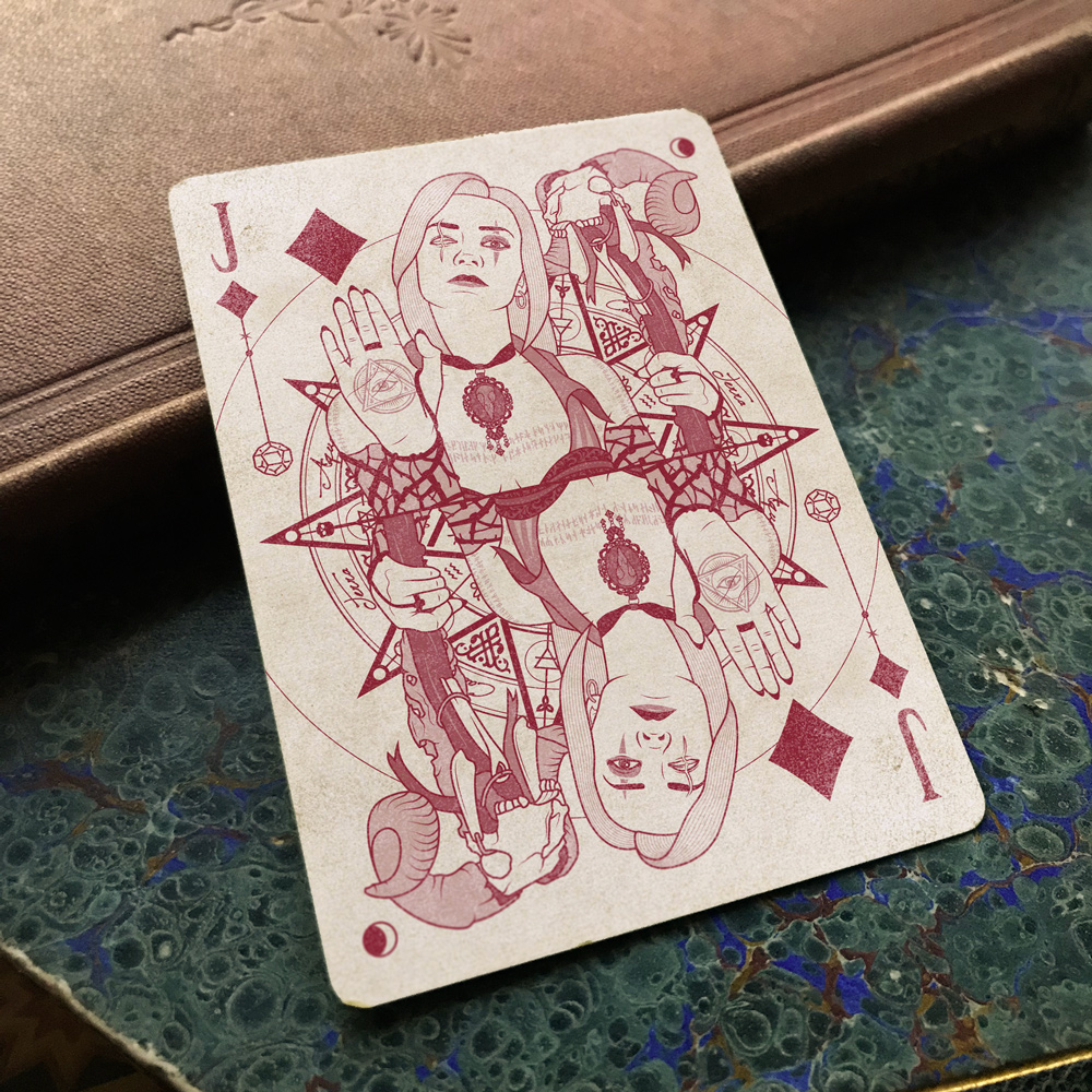
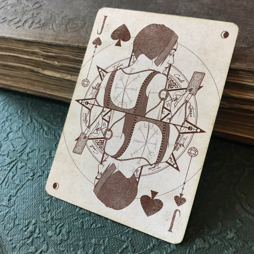
I have the Jack of Spades for the egale eyes of the forum. Let me know your thoughts, any critiques are gratefully appriciated
rousselle wrote:Wouldn't that be... the Jill of Spades?
I see what you did there . . .
Re: The Coven - Second Edition
Posted: Sun Sep 01, 2019 2:06 pm
by Brian
Those look really nice 52Ravens!
STLBluesNut wrote:
52Ravens wrote: I need to bite the bullet and do a gold foil deck [emoji38]
Cold foil doesn't have to be gold foil. Speaking for myself only, gold foil is about 10th on my list for foil colors.
Copper>silver>colors blue, red, etc>gold
Sent from my S10+ using Tapatalk
I think this deck would look great with some copper foil. Or come to think of it, any of or some combination of copper, silver, gold... "elemental" foils could fit the theme nicely.
Re: The Coven - Second Edition
Posted: Mon Sep 02, 2019 12:38 am
by Kage X
Love the crescent moon on the top right corner but noticed that while the JoD has it as well, the JoC doesn't?
Re: The Coven - Second Edition
Posted: Thu Sep 05, 2019 4:54 am
by Eric Lee
Räpylätassu wrote:I love it!
Give her some cleavege though, she is flat as a board
You've been so spoilt by Gio! Gotta have a nice mix of what the average woman looks like. Not everyone can be a Gio queen
Loving the borderless and faded look. If you're going for the faded, then let the red be a faded dirty dried blood red, or is that too much?
Will you be doing a back story for these ladies as you did with Sisterhood?
Re: The Coven - Second Edition
Posted: Thu Sep 05, 2019 9:41 am
by Thirdway Industries
Eric Lee wrote:
Räpylätassu wrote:I love it!
Give her some cleavege though, she is flat as a board
You've been so spoilt by Gio! Gotta have a nice mix of what the average woman looks like. Not everyone can be a Gio queen
Loving the borderless and faded look. If you're going for the faded, then let the red be a faded dirty dried blood red, or is that too much?
Will you be doing a back story for these ladies as you did with Sisterhood?
Re: The Coven - Second Edition
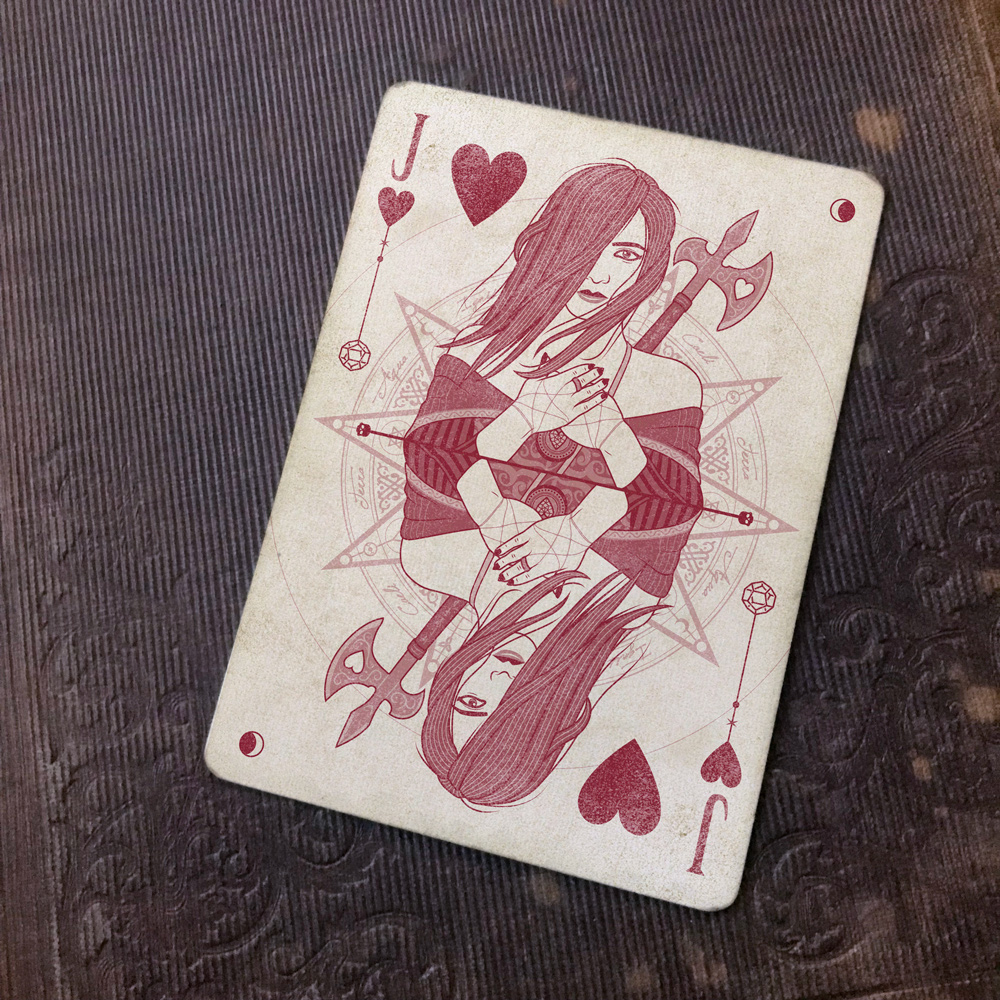
Posted: Thu Sep 05, 2019 1:58 pm
by 52Ravens
Hey!
Jack of hearts is complete and ready for critiquing. I've faded the design in the background as it was starting to get a little distracting, what do you think? Faded or not faded? I'm in two minds, faded is cleaner but the not faded makes it more impactful
Brian wrote:I think this deck would look great with some copper foil. Or come to think of it, any of or some combination of copper, silver, gold... "elemental" foils could fit the theme nicely.
I like that the foil will tie in with the witchcraft elements, but I think it will distract from the aged/used feel, what do you think?
Kage X wrote:Love the crescent moon on the top right corner but noticed that while the JoD has it as well, the JoC doesn't?
Good spot, thank you!
Eric Lee wrote:Loving the borderless and faded look. If you're going for the faded, then let the red be a faded dirty dried blood red, or is that too much? Will you be doing a back story for these ladies as you did with Sisterhood?
I've gone with a pinky red to be a little different but I will give an orange red a go, anything too dark might look too close to the sepia (brown). I'm not planing on back stories or expanded stories, but more and more people are asking so I may have to do something (FFS, I wasn't even going to name them )
Re: The Coven - Second Edition
Posted: Thu Sep 05, 2019 5:45 pm
by BaconWise
I really like the look of this deck. I've been lurking in this thread for a couple of weeks now. This Jack of Hearts is super neat. The only critique I have would be to look at the proportion of her fingers to her hands. Her fingers look a bit compressed or stumpy, though it's not a great issue.
Digging the faded design. I still think it has impact and will let the character pop more if it remains washed out a bit.
52Ravens wrote:I'm not planing on back stories or expanded stories, but more and more people are asking so I may have to do something (FFS, I wasn't even going to name them )
Look at what you've done! That's what you get for sharing your work-in-progress with these UC creatures. We are quite demanding, lol
Re: The Coven - Second Edition
Posted: Thu Sep 05, 2019 6:44 pm
by rousselle
I want one of them to be named (or nicknamed) "Big Lou."
...because it's funny.
In my short story about the Greek Sirens (called "Band of Sisters"), I nicknamed one of the Sirens "Big Lou" because of that song. (Her given name was Lucinda.)

 )
)