Once again stellar design and looks like to be another home run tuck box. Printed by NPCC, which might turn some people off but really, NPCC quality is just fine in normal gameplay and no way does it feel horrible in the hands if you are just admiring the design. Maybe it is not quite as good for cardistry but I honestly don't see any real issues with them if you were to use them on standard gameplay. Well, they don't farro shuffle that well. That's about it.
This is also the continuation to the Indictus and Dominus decks.
Left my heart inSIERRA MADRE
"Finding it... that's not the hard part. It's letting go."
"One makes a trip by day, but by night one sets out on a journey." -Moominmamma
I dream of a world where wars are fought only by having dance offs. I also dream that a Finnish playing card designer would exist. The former seems more likely to happend.
Money can't buy you happiness, but it can buy you a penguin. Have you ever met a sad person with a penguin?
Are lobsters mermaids to scorpions?
"I did not hit her, it's not true, it's bullsh*t, I did not hit her, I did naaaht! Oh hai Mark!"
Ecnate, shipping to Australia for my 2 deck pledge was 52 DKK (AUD$10.27, USD $7.78). My UUSI Supra pledge by comparison is USD $25 (AUD $33). I find the price really quite reasonable on the basis of other Kickstarter projects as well. Dominus was only slightly lower at 48 DKK for 2 decks.
Only complain about this one is the printer... NPCC for such a great deck is a waste.. I hoped that Nicolai would choose one of the big printers this time, but it seems he had other plans... It's a pitty really.
I backed it nonetheless, because of the beautiful artwork and also to complete the series...
Top effort again from Nicolai.
Nice package to round off the set .... very nice.
Apart from loose cello, I cannot fault NPCC.
Even for 52 card pickup, but that hasn't happened for oops !!
I hate that.
O, I beg of you your comprehensions,
yet laugh at your contempts ....
my only competition is with myselves.
But Lèse-majesté, especially >Normans, natch.
Is jarnstill the Ars of the Hors Nebulous ?
Neigh .... the Effluxor of the Omniverse ??
1. I can't justify buying cards that will only sit on a shelf and never be opened.
2. If I was to buy these I would definitely still want one of each that I would never open.
3. Buying two of each just puts it a bit outside of what I'm willing to spend at this time.
I really want to get these, but I can't put down the cash for it.
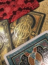
- The artwork is great, as I have come to expect from Nicolai.
- The composition and balance of the artwork is perfect. Not too busy not too minimalist.
- Delivered ahead of the February delivery estimate. This almost never happens anymore bar very few.
Cons;
Primarily printer-related (NPCC), namely -
- The black deck has several nicks out of the faces (cutting related?) on multiple cards. This shows up in a apparent way as white spider lines on the black cards (I’m sure the same are there on the white cards but not as apparent). This has the effect of cheapening the appearance of the deck. If this is the best available NPCC stock on the market, German linen 310gsm, then count me the hell out of any future releases from NPCC until technology catches up.
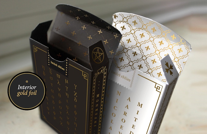
- The dark tuck (Infernum) is actually a very dark brown (not black)
- The registration is slightly off.
- The quality of the tuck is fairly ordinary, and that is being gentle.
- Embossing of the tuck, whilst deep, could have done with a feint outline of the artwork to add definition to the beautiful artwork.
On balance, I prefer the white deck (Infiniti) over the black deck (Infernum)
If these were printed with a top notch printer (USPCC, Cartamundi even) and there was metallic foil options for the cards themselves, then this would have been a home run.
Attachments
D18B1A03-99E4-4386-8CA3-CA13B1011FBF.jpeg (153.53 KiB) Viewed 1771 times
5F3DB8A2-1AB0-43B0-AAB0-B80D907F9E18.jpeg (140.08 KiB) Viewed 1771 times
96AAEF18-B43E-406B-BC53-B48526065FE1.jpeg (168.62 KiB) Viewed 1771 times
I'm gonna have to look out for those blemishes when I receive my decks. His previous 2 campaigns delivered good products. I know a lot of people don't like NPCC, but I haven't had anything negative to say about them yet. The way they cut the cards make them feel very smooth on the edges, which is really nice and feels premium, but unlike Lotrek's "perfect cuts" NPCC's makes for some difficult deck/card cuts. That's really the only criticism I've had to date.
rousselle wrote:You are a fussy, picky guy.
Lotrek wrote:Given the number of morons produced in the world every day, a pessimist is actually a well informed realist.
Räpylätassu wrote:"Tyhmyydestä sakotetaan." You get fined for being stupid.
Received mine as well in Australia. You're right about the edges of the black cards, which is a little disappointing to see. I have to strongly disagree about the quality of the tucks however, they feel and look amazing, with both embossing and foiling to boot, I've got plenty of decks from NPCC (mostly because of Nikolai admittedly) and one thing I absolutely cannot complain about is their tucks. The same can't be said for their strange difficulty with dark greys that aren't absolute black, I don't mind the very dark brown of these, but the most egregious was on the Bone & Ebon deck project, the Ebon is supposed to be dark grey, they got the tuck alright, but with the cards the dark grey they delivered and considered acceptable was a sickly green. Either way, I'm quite happy with these decks, and I gotta say they never skimp on the packaging.
Nicolai had an update about the tuck paper and it's brown and a fancier paper, along with the white tuck. A bonus for us backers from him. Yeah it's not black but feels nice.
Speaking of artwork. My mixed half brick of these and set of the entire series came in the mail today. These make me enjoy collecting playing cards. Now if I can jack up the courage to open one.
I received mine on Thursday. While I don't have any problems with whitening on the edges (as pictured above), there is a "cracked" look on all 4 corners of every card face. It's consistent, so it looks intentional or like it was designed to be that way, even though it wasn't. It's very disappointing but also doesn't affect the play-ability, of my deck, at least.
rousselle wrote:You are a fussy, picky guy.
Lotrek wrote:Given the number of morons produced in the world every day, a pessimist is actually a well informed realist.
Räpylätassu wrote:"Tyhmyydestä sakotetaan." You get fined for being stupid.